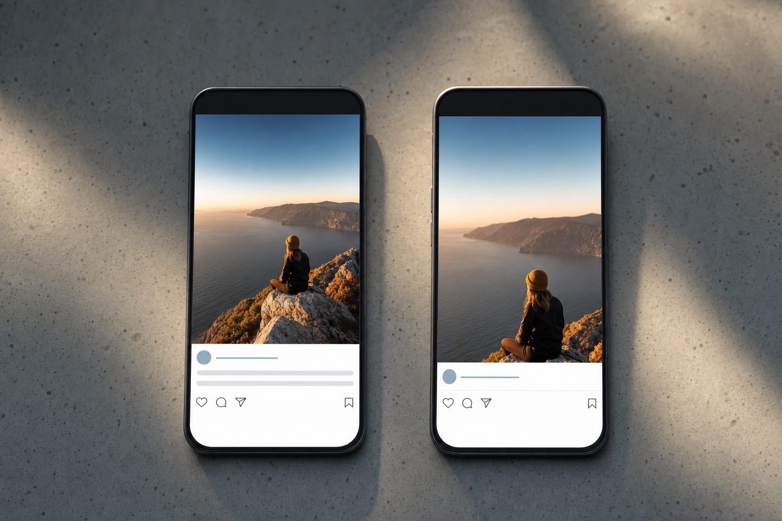
Here's a small thing that quietly costs solo founders hours every month: the gap between what a scheduling tool shows you in preview and what actually goes live. You spend ten minutes tweaking a caption so the first line lands before the "...more" cutoff, line breaks fall in the right place, and the crop frames your product. Then the post publishes — and the crop is different, the line breaks collapsed, and your hook got buried. The preview lied.
So the real decision isn't "preview vs. no preview." It's whether the preview you're trusting is accurate enough to design against. A preview that doesn't match the live post is worse than no preview at all, because it gives you false confidence and sends you back to fix things after they're already public. Let's frame the choice honestly and weigh the options.
The three ways tools handle preview
Broadly, social tools fall into three camps when it comes to showing you what a post will look like. Each has real trade-offs — none is a strawman.
| Approach | What you see | Main risk |
|---|---|---|
| No preview | A plain text box and thumbnails | You guess at cropping, cutoffs, and formatting |
| Generic preview | One stylized mockup for all platforms | Looks polished but ignores per-platform rules |
| Per-platform accurate preview | A separate render matching each network's real layout | More setup per post; still not a 100% guarantee |
The label that matters here is social media post preview accuracy — not whether a preview exists, but whether it reliably predicts the live result on each specific network.
Option 1: No preview at all
Some lightweight schedulers show you a text field and a file upload, and that's it. You hit schedule and hope. This is more honest than it sounds — it never pretends to know what Instagram or TikTok will do, so you don't build false confidence.
The trade-off is obvious: you carry all the mental math. Will the caption's first line survive the truncation point? Will a 4:5 image get center-cropped to a square in the grid? Will your hook text sit under the profile handle? You learn these rules the hard way, one published mistake at a time. For a founder posting daily, that's a slow, expensive way to build intuition.
Option 2: A generic, one-size preview
Many tools show a single attractive mockup — usually an Instagram-ish card — and reuse it for every platform. It feels reassuring and it demos well. For quick sanity checks (did I attach the right image? is the caption roughly the right length?), it's genuinely useful.
The danger is subtle. A generic preview implies accuracy it doesn't have. TikTok stacks caption text over the video with right-side UI eating the frame; YouTube Shorts truncates differently; Facebook link cards behave nothing like an Instagram carousel. When the preview shows one clean card for all of them, you optimize for a layout that doesn't exist on most of your channels. You did the work and still got surprised — the worst of both worlds.
Option 3: Per-platform accurate preview (the dealbreaker feature)
The version worth paying for renders each destination against that network's real constraints: the caption truncation point, the safe zones where platform UI overlaps your creative, the aspect-ratio crop for feed vs. grid, and where line breaks actually hold. When your preview matches the live post, you design once and ship — no post-publish scramble.
The honest trade-off: this takes slightly more per post, because you may adjust a caption or crop per platform instead of blasting one identical version everywhere. And no preview can promise pixel-perfection forever — platforms change their layouts, and rendering can lag those changes by a few weeks. "Accurate" means "reliably predictive," not "magically immune to updates."
This is where VibeDay leans. VibeDay creates the content — image, video, or carousels built for the feed — and shows you a per-platform preview so you can catch a buried hook before it's live, then schedules across Instagram, TikTok, Facebook, and YouTube. One honest note: publishing is approval-gated by the platforms, so it's a review-and-approve flow, not a magic one-tap-to-live button. The preview's job is to make that approval the last decision you make, not the first of several fixes.
Because the first line is what the preview should protect most, test your opening before you schedule with the free Scroll-Stopper Score — it tells you whether your hook earns the tap once the caption gets truncated. If you're weighing tools generally, our Buffer alternative breakdown covers how preview fidelity stacks up against other features.
Key takeaways
- The real question isn't preview vs. no preview — it's whether the preview reliably predicts the live post.
- A generic, one-size mockup is the sneakiest option: it looks accurate and quietly isn't.
- No preview is at least honest, but it makes you learn every platform quirk by publishing mistakes.
- Recommendation: prioritize per-platform accurate previews (truncation, safe zones, crops). It's the one preview feature that actually saves rework.
- Accept the trade-off: accurate previews need slightly more per-post attention and can lag platform layout changes — no tool escapes that.
- Remember publishing across networks is approval-gated everywhere; treat 'one-click live' claims with suspicion.
What does 'social media post preview accuracy' actually mean?
It means the preview matches what publishes live on each specific platform — the caption truncation point, the crop applied to your image, the safe zones where app UI covers your creative, and whether line breaks hold. Accuracy is about being reliably predictive, not just looking polished.
Is a generic preview really worse than no preview?
In one specific way, yes: it creates false confidence. With no preview you know you're guessing and double-check. A generic mockup can make you skip that check, so surprises land after the post is already public — which costs more time to fix than getting it right upfront.
Does VibeDay publish directly to platforms?
VibeDay creates content and schedules across Instagram, TikTok, Facebook, and YouTube, with per-platform previews so you can catch problems first. Actual publishing is approval-gated by the platforms, so it's a review-and-approve flow rather than an instant one-tap-to-live action.
Why can't any preview be perfect?
Platforms update their layouts, crops, and truncation rules on their own schedule, and rendering can lag those changes by a few weeks. A good preview is reliably predictive most of the time — treat any claim of permanent pixel-perfection with skepticism.
Want to see your post the way each platform will — before it goes live? Try VibeDay and design against an accurate preview instead of guessing.
Start free with VibeDay →Put your content engine on autopilot
VibeDay turns one idea into scroll-stopping posts — image, video, and carousel — captioned for every platform.
Start your free 7-day trial →