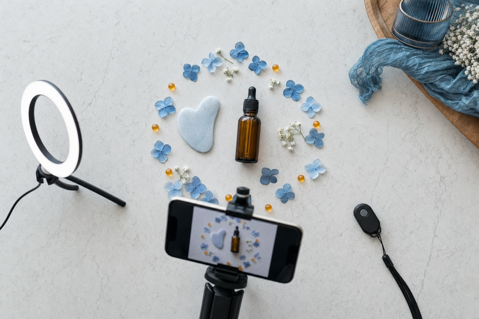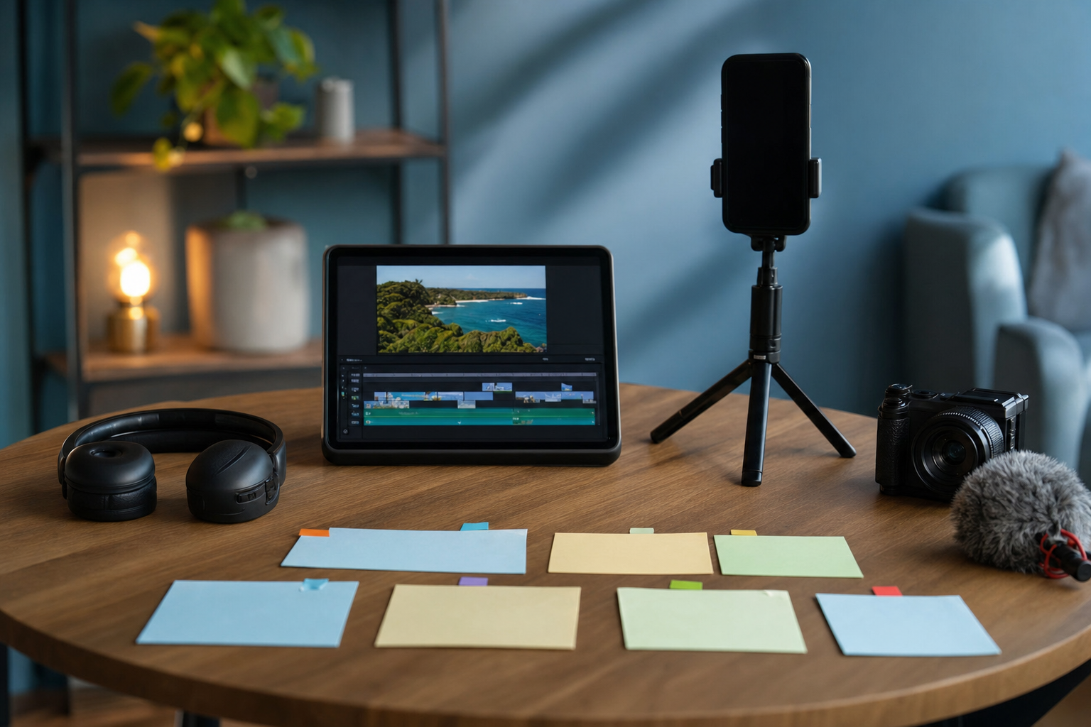
Here's the truth about Shorts thumbnails: in the swipe feed, almost nobody sees them. The video just plays. But the moment someone searches, lands on your channel's Shorts tab, or browses a playlist, your cover frame is the whole pitch. Those are high-intent viewers. Design for them.
1. Know where your thumbnail actually shows up
Stop designing for the feed. Your cover frame does its real work on surfaces where viewers pick from a grid or list:
- Search results, where Shorts sit alongside other videos
- Your channel's Shorts tab, shown as a vertical grid
- Playlists and shelves on your channel
- Shares and embeds, where a static frame represents the video
2. Design for a tiny vertical tile
On a channel grid, your Short might be the size of a thumbnail on a phone screen. Fine detail disappears. Use one clear subject, strong contrast, and a simple background. Squint at it: if you can't tell what the video is about, neither can a scroller.
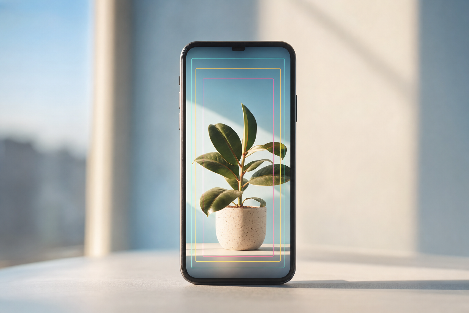
3. Keep text short and centered
Interface elements and cropping can eat the edges of a vertical frame, and the same thumbnail may be shown at different aspect ratios across surfaces. Keep any text to a few words and place it in the middle third. Treat the edges as a danger zone.
4. Match the words people search
Search is where thumbnails earn their keep. If someone searches a specific question, a cover that visibly echoes it (along with a matching title) signals "this answers you." A cover that just says "wait for it" doesn't. Write the on-frame words like a search answer, not a teaser.
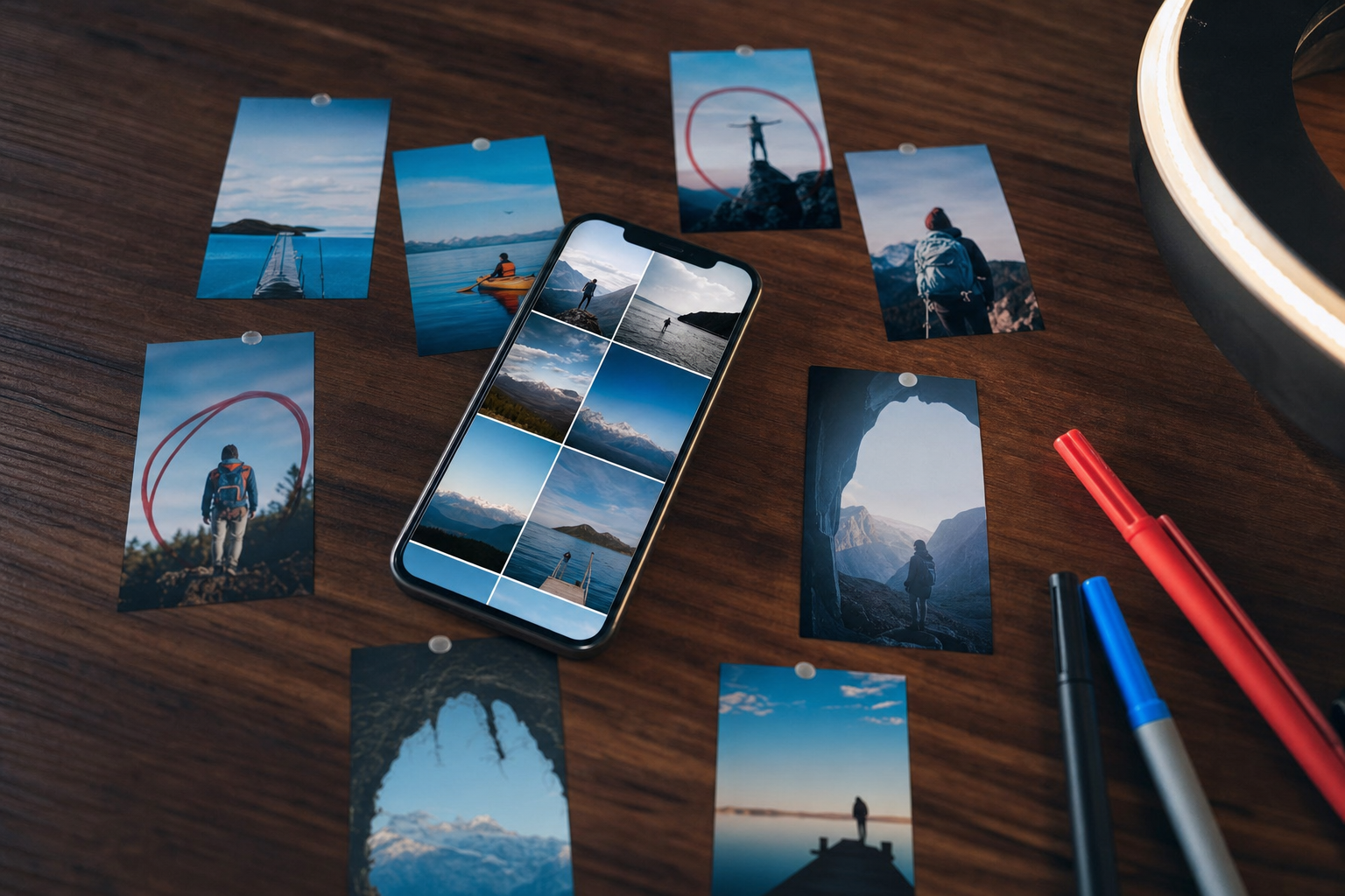
5. Make your channel grid look like a brand
Someone who taps your profile sees a wall of covers at once. Consistency builds trust and makes the grid scannable:
- Pick one or two brand colors and a consistent font
- Use a repeatable layout for each content series
- Label series covers (e.g. "Tip #12") so binge-watchers know where to go next
6. Plan the cover frame while you shoot
If you can only pick a frame from the video, the best thumbnail has to exist in the footage. Hold a clean, expressive pose for a beat, or add a deliberate title card at the start. It doubles as a strong opener, so test that first line with the free Scroll-Stopper Score before you publish.
7. Audit and refresh your top Shorts
Look at YouTube Studio analytics for traffic sources. Shorts that pull views from search or channel pages are the ones where a better cover can move the needle. Refresh those first, then note what changes over the following weeks rather than guessing.
Key takeaways
- Shorts thumbnails rarely matter in the feed but matter a lot in search, channel pages, and playlists.
- Design for small vertical tiles: one subject, high contrast, few words, centered.
- Echo search intent and keep a consistent grid style.
- Plan cover frames during filming and prioritize Shorts that get search traffic.
Want to batch Shorts and keep covers consistent without a design team? VibeDay helps you create vertical video and carousels, schedule them across YouTube, TikTok, Instagram, and Facebook, and see what's performing. See how it works on our AI video for social media page.
Plan, create, and schedule your next batch of Shorts in one place, with performance reporting built in.
Try VibeDay free →Put your content engine on autopilot
VibeDay turns one idea into scroll-stopping posts — image, video, and carousel — captioned for every platform.
Start your free 7-day trial →